Case study05 / 05
Hesam Studio
Identity for an architecture practice
An arched monogram and a calm, journal-like visual voice for an architecture and interior design practice.

ALA HESAMSelected works@alaphillia
Identity for an architecture practice
An arched monogram and a calm, journal-like visual voice for an architecture and interior design practice.
An architecture studio working on homes, shops and hospitality needed one mark and one voice that could hold all of its projects together.
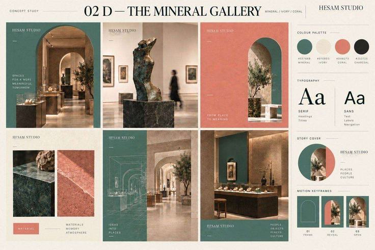
The arch became the frame for the H and the S, taken from the doorways and niches the studio designs.
Mineral green, ivory and coral, with refined serif titles. The Mineral Gallery board tests the system on a real space.